ShopDreamUp AI ArtDreamUp
Deviation Actions


Description
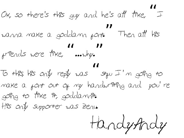
It's kind-of.. awful...
I recommend a minimum pointsize of 28, maybe using false-bold (or adding a stroke if in InDesign).
It's based on my handwriting.... if you're going to use it, make sure to set the kerning to optical instead of metrics (adobe suite only, of course). If you're in Word... you're kind-of boned.
Then again, the built-in kerning more closely matches the spacing my handwriting has naturally, so I guess it really depends on what you're going for.
In both cases, you're probably going to go in and manually kern a bit to bump legibility.
Only one style is included, "Awesome."
Comments5
Join the community to add your comment. Already a deviant? Log In
THANKS